Let us know what type of content you'd like to see more of. Fill out our three question survey.
Visualizing Remotely Sensed Data: True Color and False Color
This post is one of a series of posts on Remote Sensing.
Aug 29, 2019
What kind of images do you think of when you imagine Google Maps of our planet? Landmarks? Roads? Roads on top of satellite imagery? When we see that satellite imagery base map, we generally expect to see a representation of the earth that matches our reality. This is what we call in the world of remote sensing, “natural color.” For the average person, this use of earth-sensing satellites is the most useful, but in reality it represents only a fraction of the information gathered.
As you can see in the figure below, satellites can sense more than just reflected energy in the visible part of the spectrum, which is fundamental to myriad types of environmental-sensing analysis.
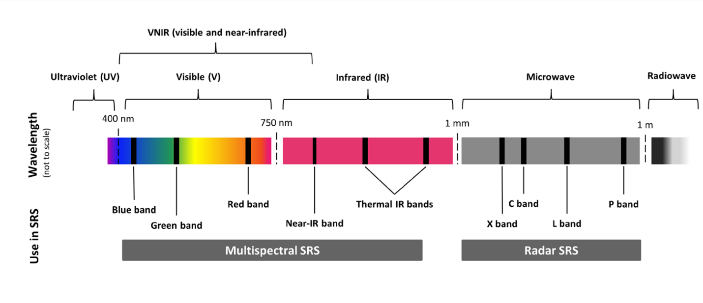
Electromagnetic radiation spectrum with bands used in satellite remote sensing (SRS) Source: Pettorelli, Nathalie & Schulte to Buehne, Henrike & Shapiro, Aurelie & Glover-Kapfer, Paul. (2018). Conservation Technology Series Issue 4: SATELLITE REMOTE SENSING FOR CONSERVATION. 10.13140/RG.2.2.25962.41926.
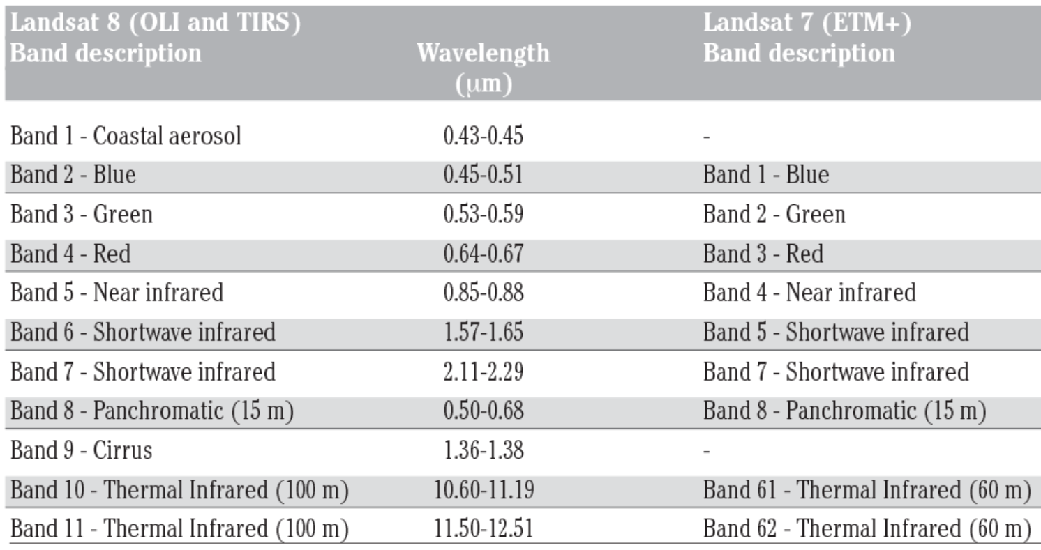
For illustrative purposes I will use Landsat 8 multi-spectral sensor (MSS) bands, and for visual examples, specifically an image from August 2019. Below you can see what wavelength (aka color) each band of the Landsat 8 MSS is calibrated to “see.”
Each of these bands when displayed alone is a panchromatic image (gray-scaled), so how do we get a beautiful natural image of the earth that looks something like what we would expect? We can do this by compositing or “stacking” multiple images. Ever heard of RGB? No, not Ruth Ginsburg Bader… I mean Ruth Bader Ginsburg. Red, green, and blue! You know the spectral bands our computer monitors, television screens, and other electronic displays use to present our eyes with the appropriate combination of colors to see the world in natural colors. I won’t get into theories of additive mixing of light, but electronic displays use these three colors to produce a wide array of possible colors. Using the chart above, which bands would you use to create a “natural color” image stack on your computer screen?
I hope you chose Band 2, Band 3, and Band 4. I won’t get into software with which to stack image layers, but you can do this with a product that starts with “photo” and ends with “shop.” You can find a good tutorial here.
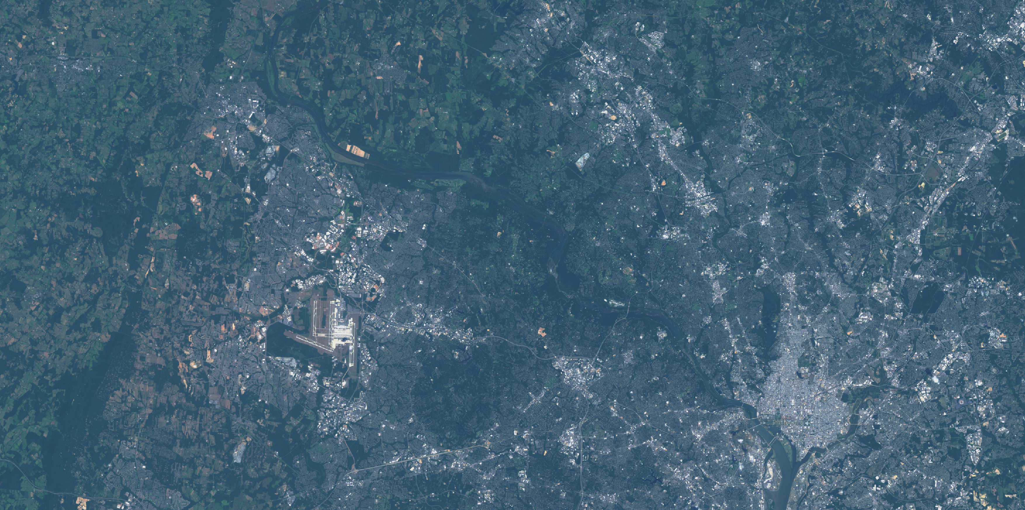
Since we are displaying this stack with the RGB capability of our computer screen and we want a natural color image of our area of interest (image from August 2019), we would stack the image such that Band 4 (red) is displayed as red on our screen, Band 3 (green) is displayed as green, etc. In common shorthand, this is called a 4-3-2 composite or stack and looks how you would expect.
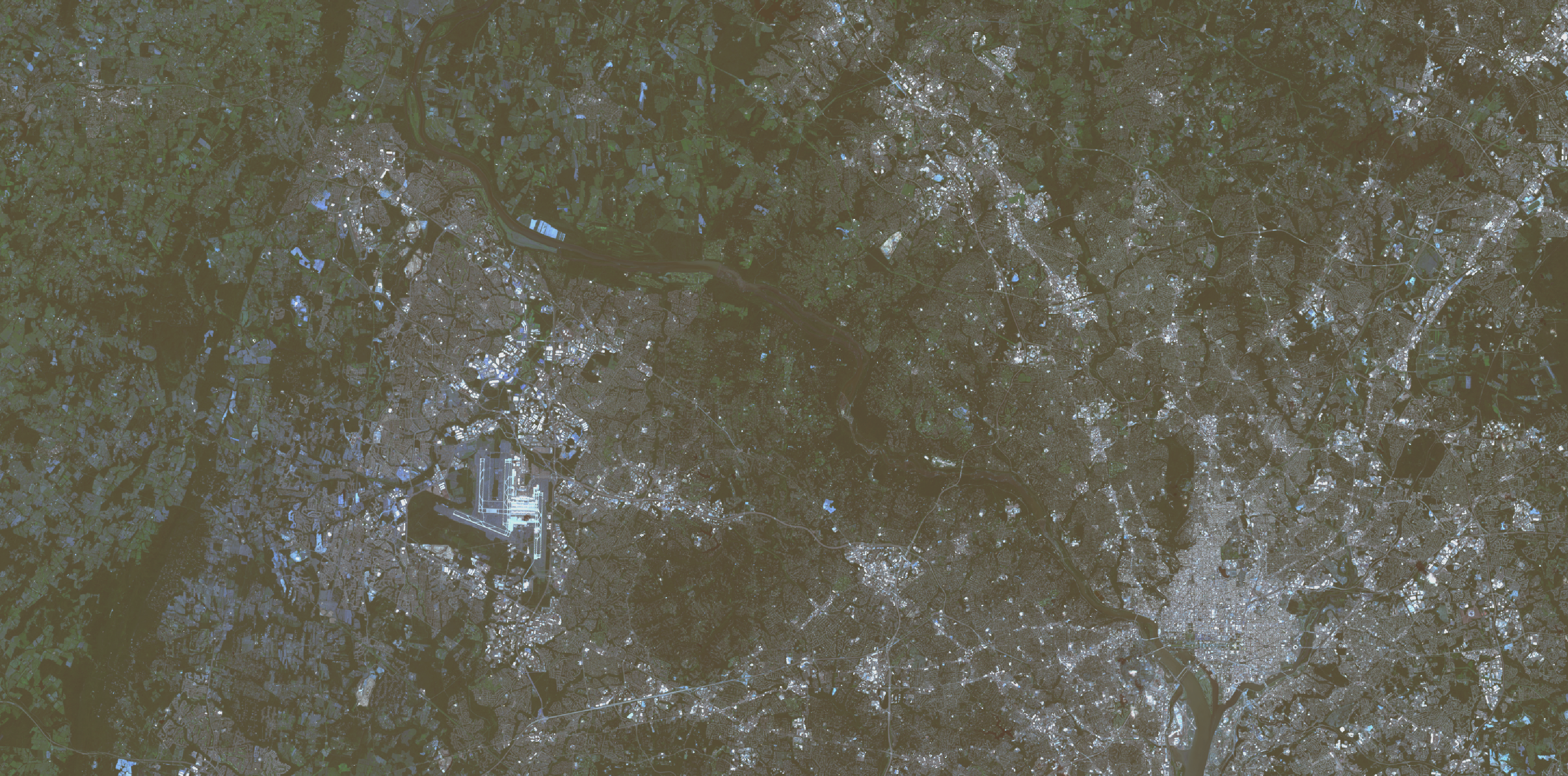
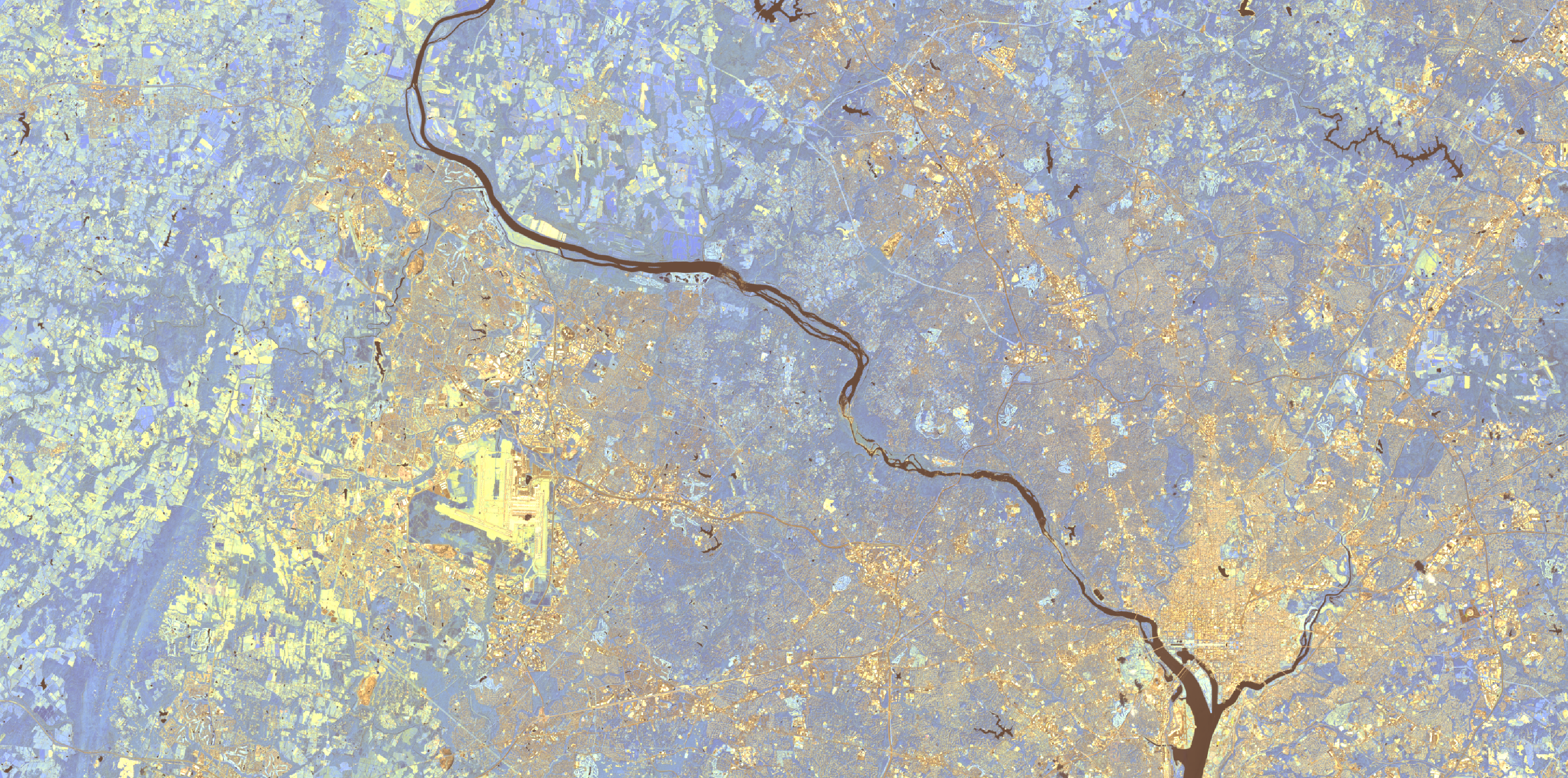
Now what would happen if you messed up and made a 2-3-4 composite? Well, objects in your image that were red would be displayed as blue and blue as red. Green would still be green, but your image would look a little odd. See below.
Other Band Combinations
Up to this point we have not talked about the other bands. What are those all for? Well the handy chart gives you a decent clue. Near- and short-wave infrared are intriguing (and very useful) bands, but they’re outside of the visual spectrum. So how can we see them?
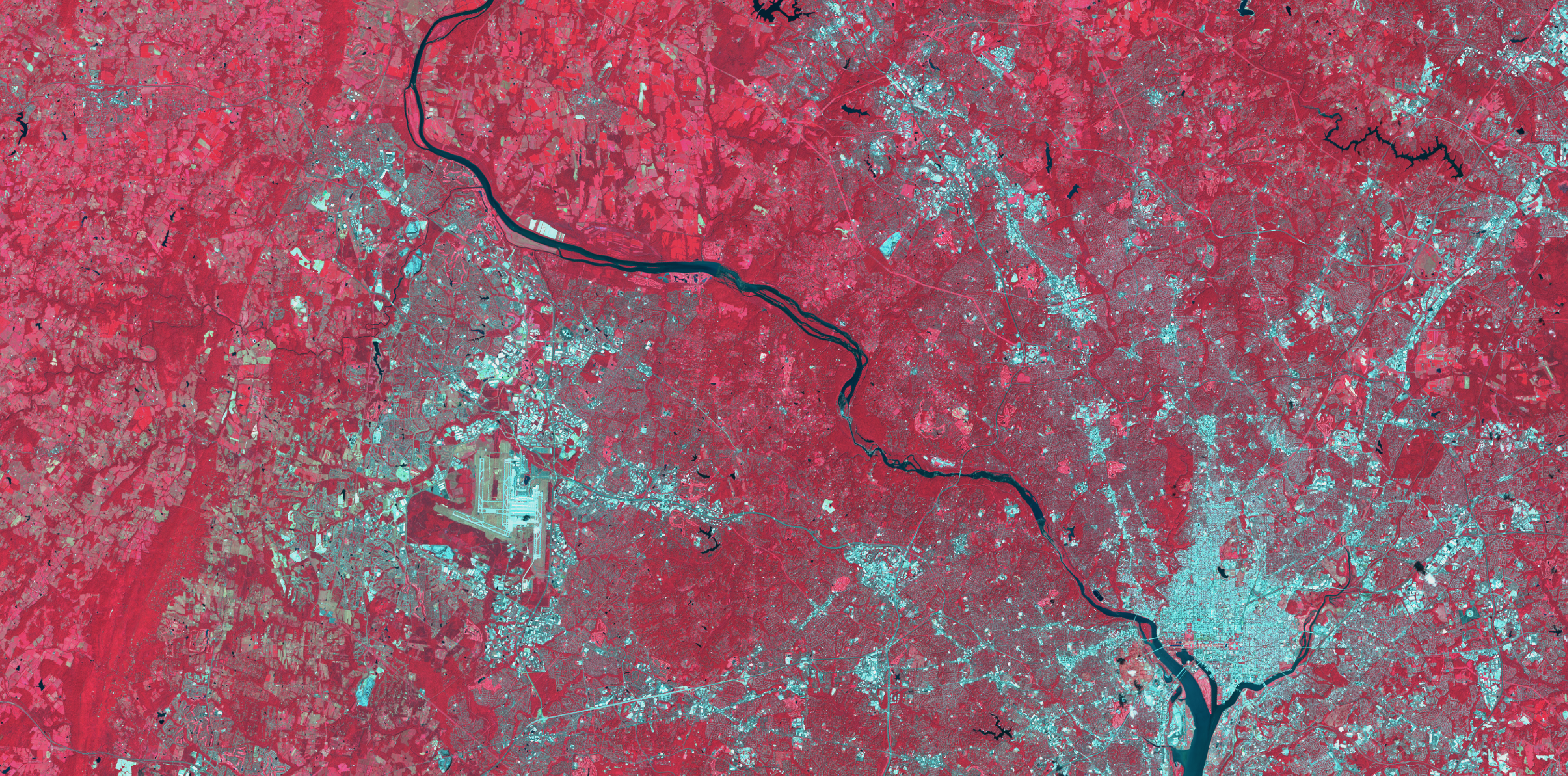
The beauty of this multi-spectral sensor is just that the satellite senses energy (light from the sun) reflecting from the earth’s surface back to the sensor at different wavelengths depending on the composition of the object the light struck. This means that we can take bands 5, 6, 7 (or 7-6-5), for example, and stack them in the RGB color space so that our screens can display infrared and near-infrared light we can see! See the image below.
You can immediately see how certain features are more distinct using this band combination versus a natural color image. Impervious surfaces such as roads, buildings, airports reflect and absorb different wavelengths of light as do different soil types, agricultural fields, and water. I could spend days reviewing spectral signatures of various land cover types, but I merely want to illustrate how different questions can inform which satellite band combination works best for your work.
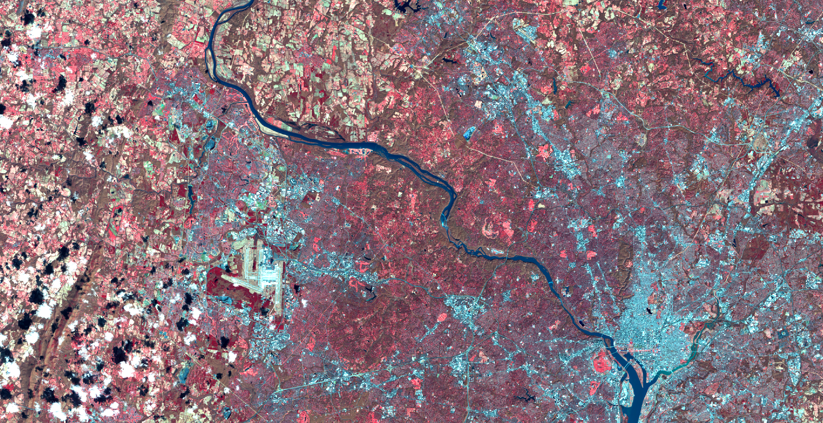
What happens if we jumble the bands around a bit? Suppose we make a 5-4-3 composite? What bands are mapped to which colors in the RGB space? Near infrared is mapped to red, red to green, and green to blue. creating the image below.
But why is all the vegetation red? Well, without getting too into the weeds of color theory, plants absorb red and blue wave lengths of light (which is why the appear green!) and reflect near infrared—more when they are healthy (i.e., contains more chlorophyll. More on this. With the red band mapped to the green band, we effectively remove the green wavelengths from the image since we are not displaying any green reflectance and the red and blue are absorbed by the plant if healthy). This means that with this band combination we can, at a glance, assess the presence of, and health of, vegetation.
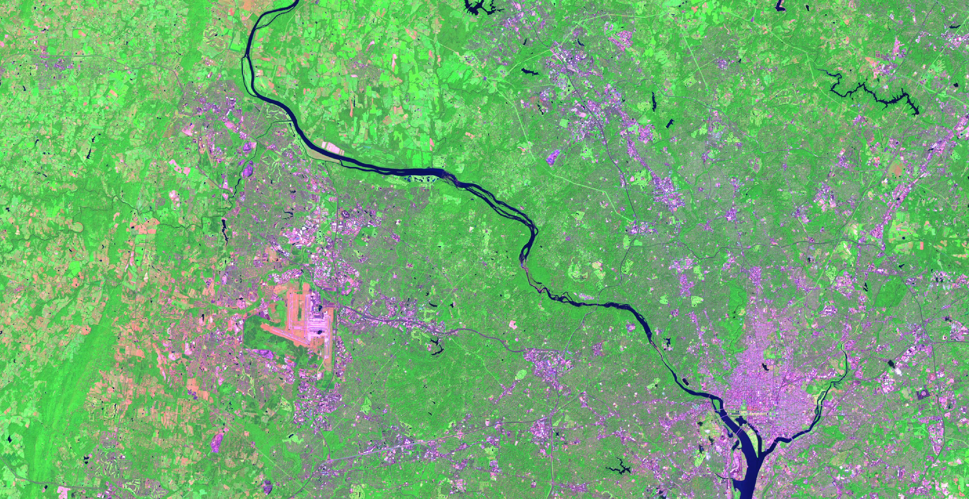
Here is the same image from March 2019 where the trees have few or no leaves yet.
You can readily see the difference in level of near-infrared reflectance from vegetation before spring has sprung.
There are of course many more combinations, each uniquely positioned to assist in answering different research questions, and the best part of this all is that all Landsat data is FREE!
I often find visualizing remote-sensing data can feel more like art than work, and need to reign myself in so as not to get too lost in adjusting the colors for optimal viewing, or panning around the map finding new interesting features of the landscape to ponder. For reference, one of my personal favorite combinations for discerning between vegetation and infrastructure is 7-5-3 that removes some atmospheric haze.
Which is your favorite?
This is a followup to the second installment in the Remote Sensing Series from January 2017.