Open Source Series Part 2: Spatial Analysis with QGIS (Article 1/2)
This post is one of a series of posts on Open Source.
Aug 23, 2017
In part one of this two-part article, we’ll explore the open source geographic information system (GIS) software package, QGIS, through a look at its history, and take a sneak peek at the upcoming release of Version 3.0, which is scheduled for release this fall.

There’s been a buzz around the release of QGIS version 3.0 for a couple of years now. QGIS has been my go-to desktop GIS application for the past five years, so I was thrilled to receive an e-mail from the QGIS LinkedIn user group with a link to beta test QGIS 2.99, a pre-release copy of the version 3.0. No hesitation there, it was finally a time to give it a whirl.
What is QGIS?
QGIS, formerly known as Quantum GIS, is a powerful desktop software application that puts spatial analysis and cartographic capabilities in the hands of anyone with a computer capable of rendering large files, and the willingness to learn. It is arguably the most powerful open source desktop GIS available today, is currently translated into more than 40 languages, and is backed by some very dedicated developers. QGIS version 0.0.1 was originally developed and released by Gary Sherman in July 2002, and was adopted as an incubator project of the Open Source Geospatial Foundation in 2007. Version 1.0, called Kore, was released in early 2009.
While I used the application throughout releases of Version 1, Version 2.0, called Dufour, is when I started to rely on the software for everyday GIS tasks. The application was capable of functions you could previously only expect to find in proprietary software. You can take a look at the change-logs here, but that new release introduced smarter labeling functions, improved heat maps, a visual process modeling function, new features for raster analysis, a layer panel that was easier to navigate, a better print composer, and much more. Each new release along the 2.x series brought improvements, and new converts to the QGIS world. So, what can we expect in Version 3.0?
Per the website GeoGeek, QGIS 3.0 includes access to the newest version of Qt and Python, a higher quality user interface, improved geometry editing and processor dialogs, new symbols, better search functions within layers, custom image sizes, and support for 3D analysis. That’s a lot. But what does that mean in practice? Let’s have a look.
Putting QGIS 3.0 to the Test
With full recognition that the software is still in beta, I booted up version 2.99 to put some very basic functions to the test.
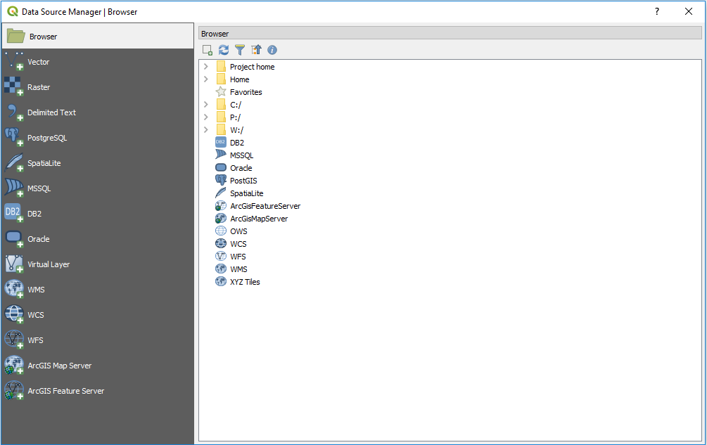
The first thing I noticed was a redesigned Data Source Manager toolbar. The data import and export function, which has always been one of QGIS’s greatest strengths, has been revamped. The software is prepared to ingest almost any kind of spatial data and database available today.
I loaded up the Admin0 global dataset from the Global Administrative Areas website, and a .csv of child mortality rates by country over time from the World Bank’s Open Data portal. A quick glance at the Attributes Table view showed a very similar interface. The Field Calculator and sorting functions were all familiar. Not much changed here.
Opening the Layer Properties panel, I noticed a couple of new features, including a new “Information” page, improved access to meta data, and maybe most interestingly, a section on “Dependencies,” which enables the user to control how data sets interact when changes are made to the underlying data. I can see this being incredibly useful when joining multiple layers, or running spatial calculations across multiple layers.

The next thing I looked at was the Processing Toolbox, which includes a host of analytical functions. This interface had been totally overhauled from version 2.18, and is arguably where the power of GIS begins. I won’t go into much detail on these functions here, but will just compliment the design team on making the section much more inviting.
Back to the mapping…
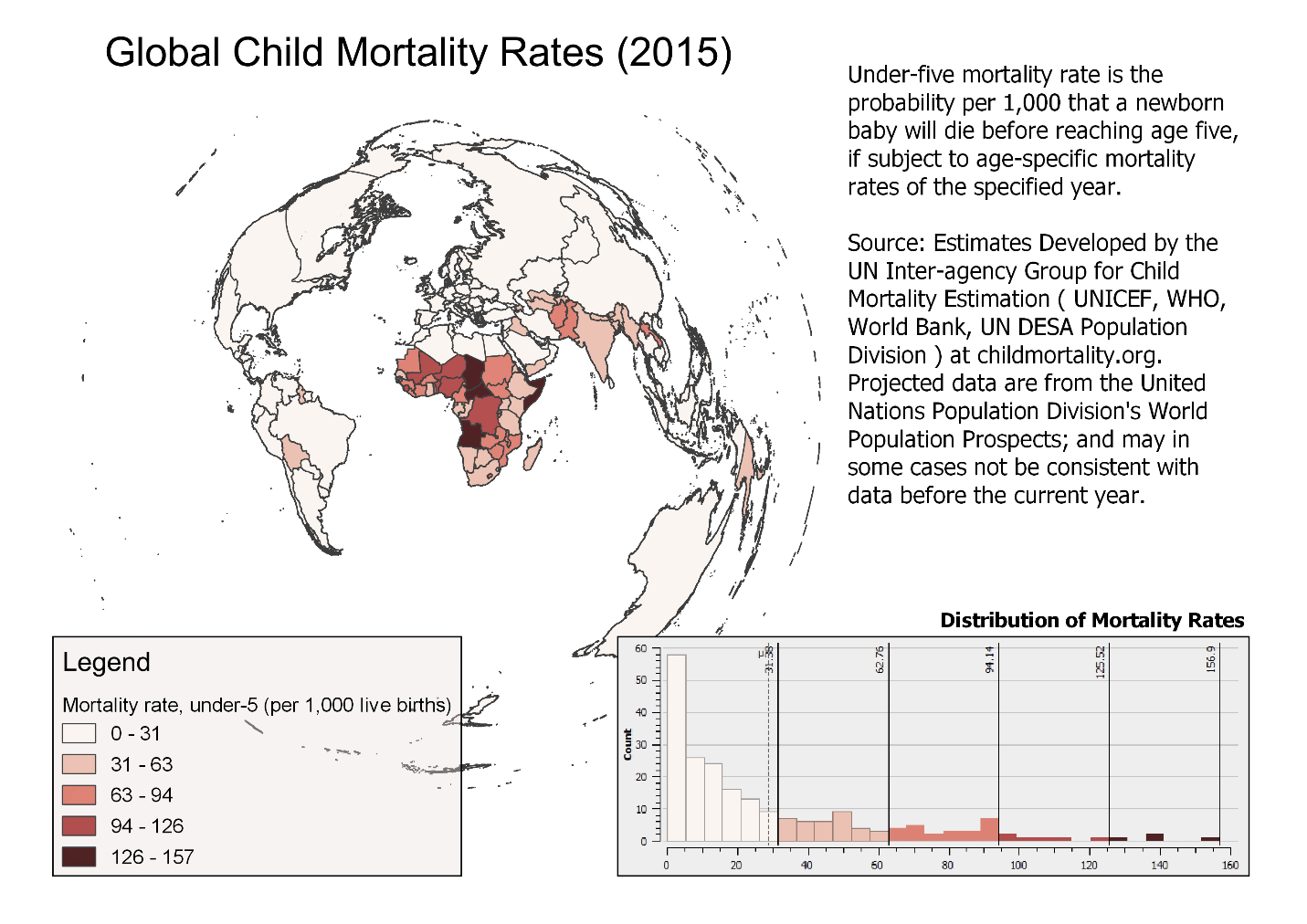
I quickly joined the World Bank data to the Global Boundaries, created a choropleth map based on 2015 child mortality projections using Equal Intervals as the color ramp mode, and rendered the polygons as a sphere using the Azimuthal Equidistant projection.
The whole process took no more than an hour (including poking around at the new buttons), and rendered the following map, which displays child mortality rates (under age 5) per 1,000 live births.

While there may be a package or function that already accomplishes this, I’d like to highlight that the histogram included in the map is a screen grab from the Properties - > Symbology box. As we increasingly see data visualization software like Tableau and PowerBI take root in offices around the world, I think it would be useful to integrate more accessible graphing/charting functionality. Maps are great, but in my experience they’re best explained when paired with another visual form.
What we’ve done here is just scratch the surface of QGIS, but hopefully it provides a glimpse into the power of this tool, and may encourage you to try using this free software. So what GIS tools do you use in your organization? We’d love to hear from you. If you have 10 seconds, check out the survey below. If we get enough responses we’ll report on them in another post, where we’ll compare QGIS to proprietary applications, and make recommendations on which is best suited for your organization.