Let us know what type of content you'd like to see more of. Fill out our three question survey.
6 Tips for Making Great Monitoring and Evaluation Dashboards
Jan 15, 2019
Technology and data are converging in ways that allow monitoring and evaluation (M&E) professionals to more effectively monitor, evaluate, learn, and adapt on their projects. Dashboards are one of the key tools contributing to this trend, having become more accessible and user friendly through platforms such as Microsoft PowerBI.
Dashboards are an information management tool that visually track, analyze, and display metrics and data points to monitor the status of a project. DAI is creating dashboards for all new projects to enable teams to learn, evaluate, and adapt to project realities in near real-time. Ultimately, these dashboards make for better monitoring and evaluation and—in turn—better projects. Therefore, it’s important to get it right. So where should you start?
1. Define the Purpose for the Dashboard
Dashboards can be designed for different purposes, and it’s important to clarify the purpose before commencing design. Will your dashboard help to monitor indicators? Will it frame results from a baseline or midline analysis? What types of decisions will it inform? Will it help the team evaluate and learn from specific activities or events? Dashboards only display a limited amount of information and having a clear objective for how the dashboard will be used by the team will help focus your design efforts.
2. Know Your Audience
Knowing who will use the dashboard is critical to informing its design. People interact with data differently depending on their roles, responsibilities, and connection to the project. For example, the Chief of Party might only want a high-level summary of key findings, while the M&E team is likely to want the granular details. Alternatively, a client may have a different perspective you need to consider when designing the dashboard. PowerBI allows you to design dashboards for various audiences through features like “drill-through,” which moves a user from high-level insights to more detailed information. Knowing what is important to your audience is the best way to ensure their needs are met at each step of the design process.
3. What is the Message We Want to Communicate?
Having a clear message you want to communicate will help guide your dashboard design. Not every indicator, survey question, or data point is created equal. Prior to creating a dashboard, it is critical that you do a little exploratory data analysis to understand the key insights you ultimately want to communicate in the dashboard. This message or story should align to your visualization choices, such as maps and other plots.

4. Reduce Clutter with the 10-15 Rule
Cluttered dashboards are hard to read and understand. Your dashboard needs to convey information clearly and quickly. If your audience can’t understand what your dashboard is telling them in 10 to 15 seconds, then you need to go back and revise it—doing whatever it takes to get below that number. Remember your choice of visualizations and information should always clearly fit the dashboard’s purpose and should connect to your audience. If the visual or information doesn’t do both, it should be rethought or removed. When designing dashboards, you should be coming back and regularly referencing the dashboard. Achieving the 10-15 rule will ensure the dashboard is used often.

5. Leverage the Most-viewed Spot
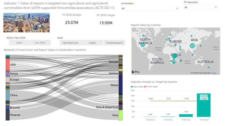
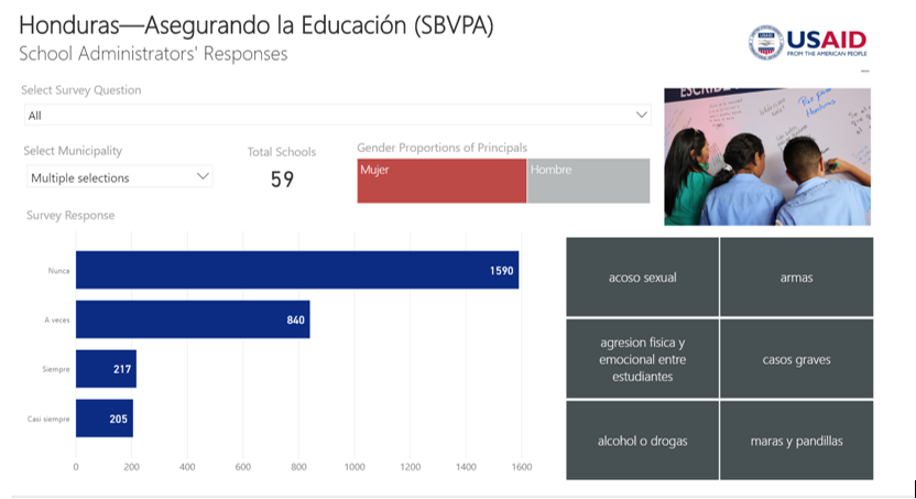
Most viewers scan the web starting at the top left of the page. Go back to thinking about your audience, message, and purpose. Then place your most important information so that it occupies or spans the upper left-corner of your dashboard. In the example below, the dashboard includes the most important information at the top and can be viewed from left to right.
6. Some General Rules About Visualizations
Remember to keep it simple. Most people can only manage a few visuals per page and in most cases basic bar or line charts will suffice.
-
Indicators containing targets and actuals are typically best displayed using gauges, bar charts, and line charts.
-
Bar charts should be used rather than pie charts—you cannot see the difference between pie fields which have similar values.
-
Horizontal bars work best for rankings.
-
Line plots are usually for time series plots comparing multiple series like a targets or actuals.
-
Bubble plots are used when presenting three different values (x-axis, y-axis, and bubble size).
-
Make sure colors fit diverging or sequential data. When choosing colors check color brewer for guidance on color palates for plots and maps.
In the end, remember the dashboard is just a data visualization tool and will only be successful when connected to a project’s communication, evaluation, or learning strategy. Keep this in mind when creating dashboards and constantly look for ways to simplify your report design.
This guest blog was written by John Mataya. John works as a Data Scientist with DAI’s Monitoring for Development Results (MfDR) team.