Remote Sensing Part 3: Identify Healthy Vegetation From Space
This post is one of a series of posts on Remote Sensing.
Jan 23, 2017
DAI’s excitement about the upcoming SatSummit is approaching perigee levels, with the conference less than one week away! This is Part 3 of our Remote Sensing Series. In case you missed them, here’s Part 2 and Part 1.
You could live a perfectly fulfilled life while taking for granted all the colors that appear in the natural world. However, when you ask “why?”—a fascinating level of complexity is revealed, and this is especially true for the colors of nature: green forests, blue skies, red roses, golden sunsets.
The spectrum of visible colors, approximately, but not exclusively, contains: red, orange, yellow, green, indigo, blue, and violet. These colors are emitted from the sun, along with all the invisible parts of the spectrum. Pure snow, (not the gray stuff that piles up in the Walmart the parking lot) is a brilliant bright white. You may recall having to wear sunglasses when the sun is out after a fresh snowfall because of the bright reflective white stuff layering the ground. But why? The molecular structure of snow reflects nearly all of the visible spectrum back to your eye, hence the white color. It has, what remote sensing people call, high albedo.
Healthy leaves of basil are a luscious green. But why? Plants absorb, rather than reflect, most of the red and blue light that hits the leaves. Absorption of light, after all, is part of the process of photosynthesis. It is also why trees are so vital to helping cool our planet—they absorb the energy from the sun instead of reflecting it back into our atmosphere. All of that results in basil leaves being deep green instead of white.
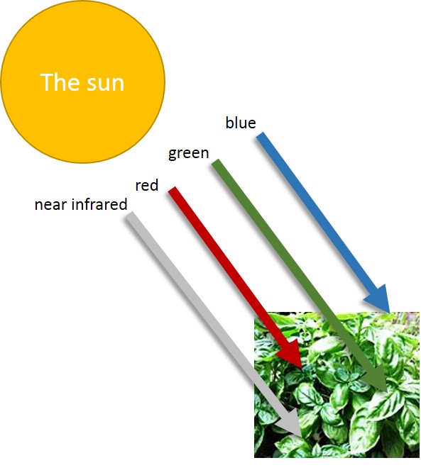
The sun sends a full spectrum of light—visible and invisible wavelengths—to earth.
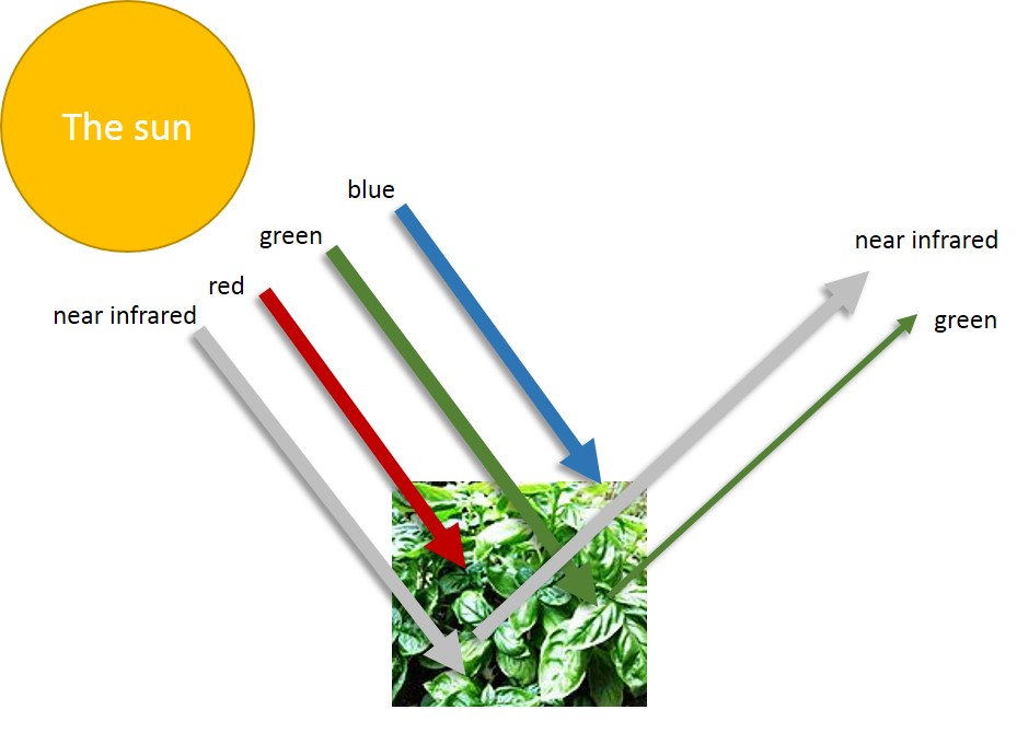
Healthy vegetation absorbs red and blue light for photosynthesis. Some of the green light and a high percentage of shortwave infrared light is reflected off the leaves.
What we don’t see, however, is that healthy plants actually reflect more near infrared (short wavelength infrared) than visible green. That’s right: healthy plants look more infrared than green. But we humans only see the green. When a plant becomes unhealthy, it reflects more of the visible red light and less of the invisible infrared. Think of a dry plant that needs watering, it might turn a reddish brown as it dries up. This difference between the visible red and the invisible near infrared light is a good measure of plant health. The bigger difference between the two, the healthier the plant.
An Index for Measuring Vegetation Health
To calculate the proportional difference in infrared light and visible red light, we can use the tried and true Normalized Difference Vegetation Index (NDVI), where NIR is near infrared and RED is visible red.
NDVI = (NIR - RED) / (NIR + RED)
If you’re the type to gloss over equations, this one is simple! First off, this is just a ratio. In the case of NDVI it is the ratio of the element’s difference to it’s sum. When the plant is really healthy, it is reflecting a ton of NIR and very little RED which means the maximum value for NDVI is 1. The range then for NDVI then is +1 to -1. Being normalized on this range is great because it lets us compare different areas of vegetation around the world, whereas doing so with raw reflectance values of near-infrared would be inconclusive.
An Example From Western Nepal
DAI implements an integrated watershed management project for the U.S. Agency for International Development called Program for Aquatic and National Resources Improvement (PANI). We can use an area of the western region where PANI operates to study the vegetation health with NDVI at two different times of the year: August 2016 just after the monsoons, and January 2017, a dry and cold period in Nepal’s weather pattern.
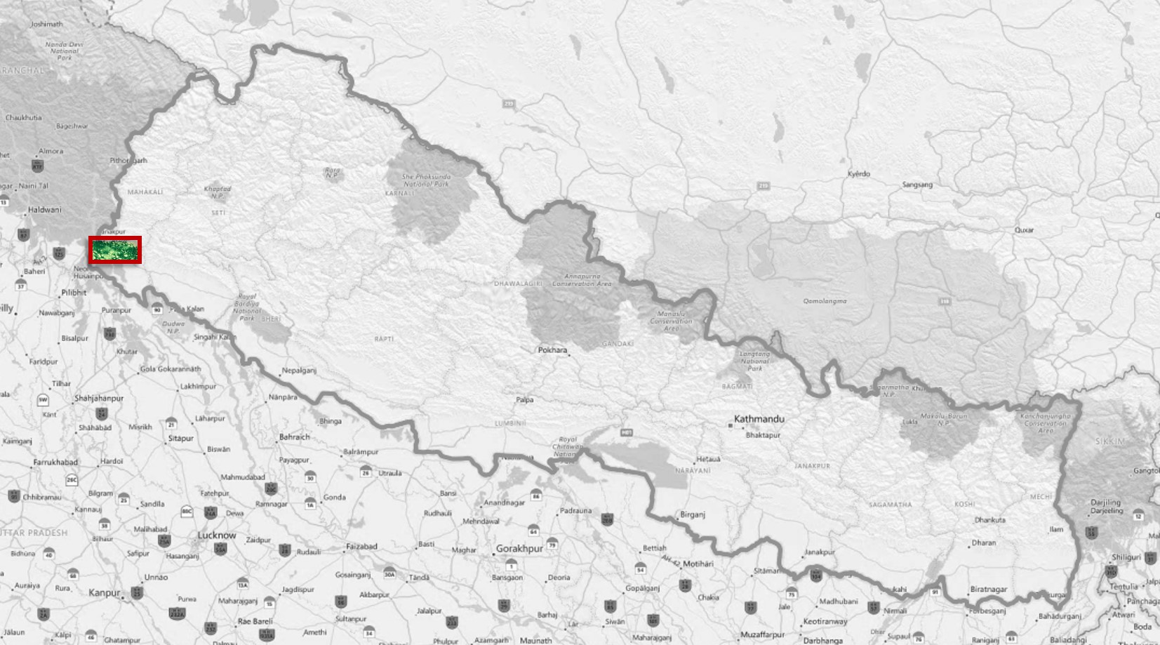
Our study area in western Nepal.
Let’s look at a true color image of an area where our PANI project operates. You can see a few clouds and a river flowing full. This is from August of 2016 just after the monsoons.
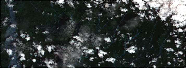
A true color image in western Nepal in August 2016 soon after the monsoon season. Notice the fat river.
To calculate the NDVI, I can use QGIS (a free desktop GIS application) and open up the raster calculator to run the formula with the red band (4) and the shortwave infrared band (5). To do this go to Raster > Raster Calculator and type in the equation into the calculator. Here are a few images from the NDVI calculations. We can see a broader area of healthy vegetation after the monsoons in August. Then later in January of this year, the only healthy vegetation is in the select areas being irrigated by local farmers. The lowland forest and the mountain areas have begun to dry out.
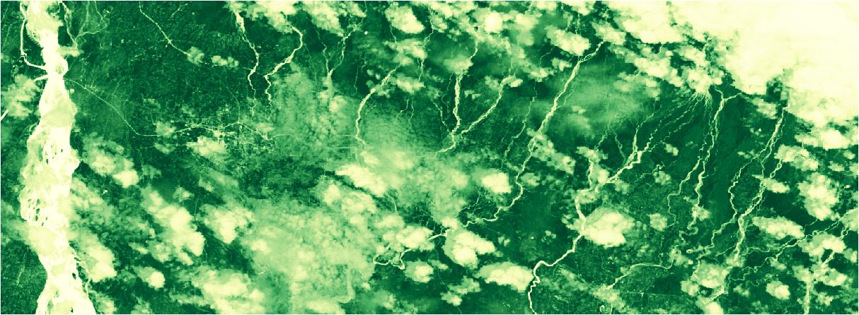
NDVI just after the monsoon season in August 2016. On the ground we see a fairly even distribution of healthy green vegetation. The bright yellow blotches are clouds are scattered about in the scene.
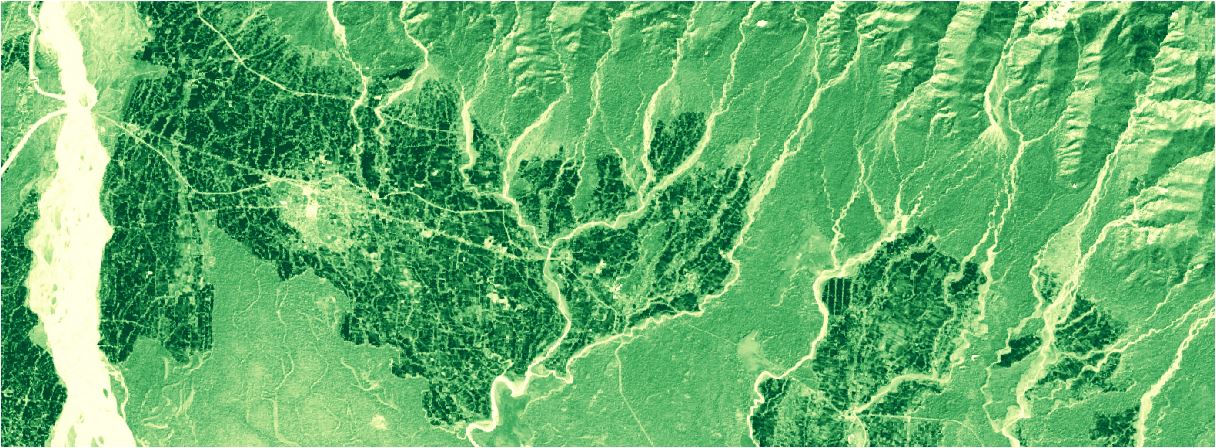
NDVI for a dry day in early January 2017. We see healthy vegetation only in the irrigated farmland, with the mountains and natural forest region drying out.
It’s very satisfying to be able to see a changes in weather reflected in satellite imagery. What’s more, we did this all with free software and free imagery from Landsat 8! We’re looking forwarding to using Landsat and NDVI to help share with the community in Nepal the freely available ways to monitor watershed health with remote sensing.