Getting Started With RStudio, Part 1
This post is one of a series of posts on Open Source.
May 24, 2018
This article is part 1 of 2, as we explore the basics of importing and analyzing data in RStudio.
As a data scientist, I spend a lot of my time working in a programming language called R. RStudio is an open source integrated development environment (IDE) for the R programming language, which focuses on programming for statistical analysis. You could arguably do data analysis in almost any computer programming language, but R offers some of the most accessible statistical functions of any language available today. You could also do this work in a business intelligence application such as Tableau or PowerBI, or conduct statistical analysis in STATA, but R and RStudio are free and open source. In this post, I’m going to introduce a few lines of code to get you started on your journey into R.

In this exercise, we’re going to execute the following commands: 1) install and start necessary packages, 2) bring a dataset into your work environment, 3) inspect your data to help you think about how it is structured, 4) convert your datatypes into useful data formats, 5) plot the data on a line graph. You could, of course, accomplish each of these tasks directly in Google Sheets, but bringing the data into RStudio opens up a new world of analytical possibilities. Let’s get started.
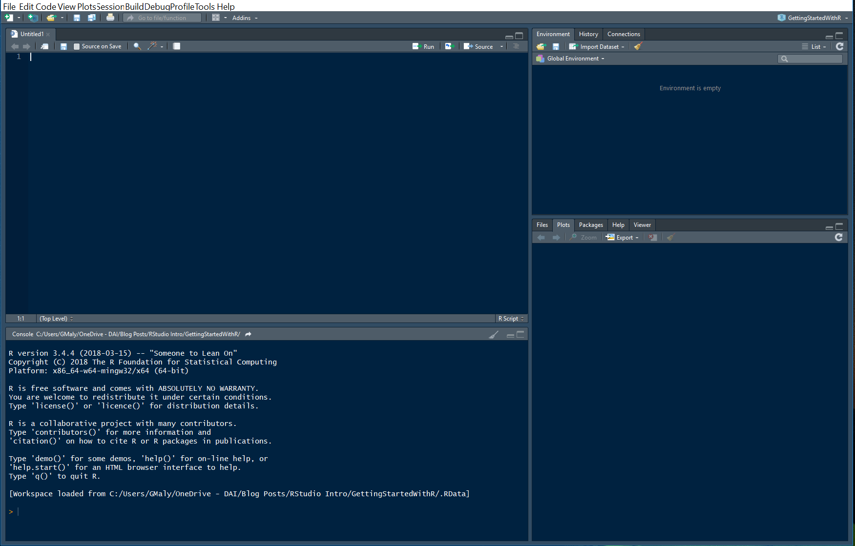
Step 0: Install R and RStudio
First, you’ll need to install R and RStudio on your computer. I’ve included some links below:
Once you get your software installed and booted up, you should see something that looks approximately like the image below.
Step 1: Identify a Data Set
The next thing to do when getting started in R, is to identify a dataset you’d like to work with. You can, of course, build up a dataset directly in RStudio, but it’s nice to have something to work with when first exploring the programming language.
For the sake of this exercise, I’ve created a dataset in Google Sheets for you to work with. Looking back on May in Washington, D.C., one of the recurring themes of the month was RAIN. The greater Washington, D.C., area experienced a recordbreaking month of rainfall. So, I pulled in some rainfall data from the National Oceanic and Atmospheric Administration. You can see that dataset here.
Before we go on, I should note that you can import data into RStudio in many different ways.
Step 2: Install Google Sheets Package
To get the googlesheets data into R, you need to import it. Fortunately, there is a handy package for Google Sheets data access. Going through this step is also a useful introduction to the concept of packages, which are functions created by other members of the R programming community. To install this particular package, you execute the following lines of code:
install.packages(“googlesheets”) library(googlesheets)
The first line tells the computer to install the package titled “googlesheets,” and the second line tells the computer to turn on the package, making it available for you to use.
Step 3: Import Data, Part 1
Now that you’ve installed the package, you can import the data. Enter the following line of code into your environment, highlight them with your cursor, and press ctrl+enter to execute them.
WeatherDataURL <-
gs_url(“https://docs.google.com/spreadsheets/d/1UNQ_LMXFdq6GmQRCUhGd1iY4GQ_a4qEN0sH_cDylU_k/edit?usp=sharing”)
At this point you should see a new variable titled “WeatherDataURL” in the upper righthand box, as can be seen in the image below.
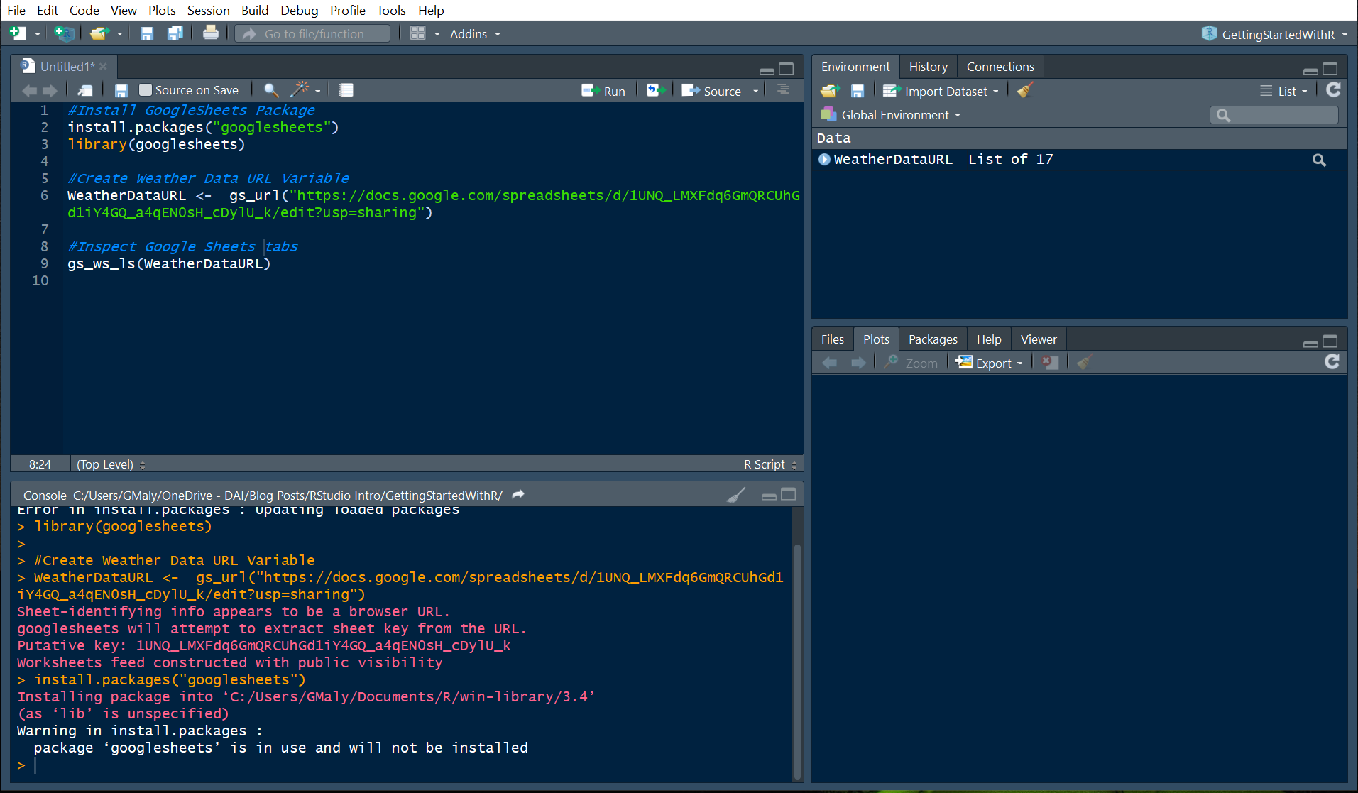
Before we move on to the next step, let’s execute one more line of code, which allows us to inspect our new variable, “WeatherDataURL.”
gs_ws_ls(WeatherDataURL)
When you execute this command, you should see the word “MayWeather” printed out on the console, which is the box in the bottom left. This is the one tab in the Google Sheet that contains the weather data for the month of May.

Step 4: Import Data, Part 2
In our last step, we prepared our connection with Google Sheets, and in this step, we’ll import the data. So now let’s read the “MayWeather” tab of the googlesheet into R as a dataframe, and inspect the structure of the data using the handy str() function. Copy the following lined of code into your R console, and execute them.
AllWeatherData <- gs_read(ss=WeatherDataURL, ws = “MayWeather”, skip = 0)
str(AllWeatherData)
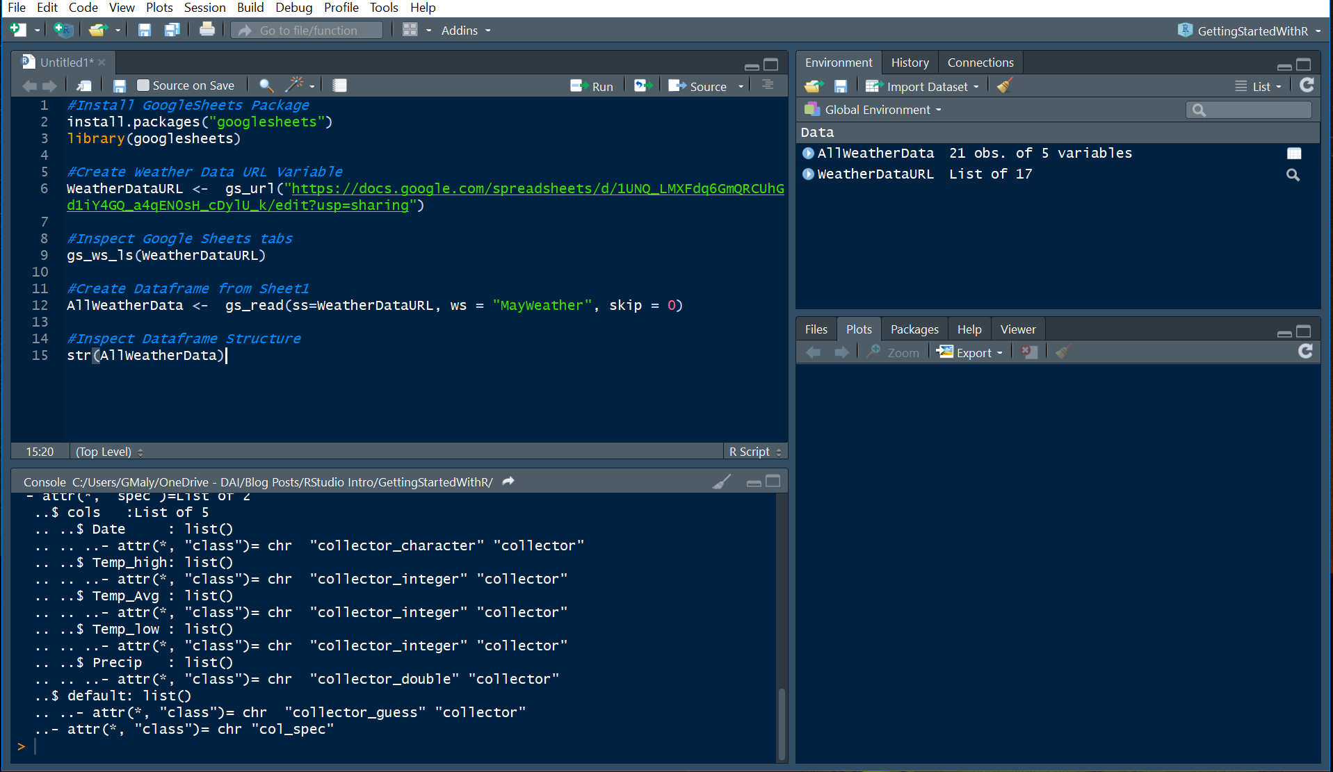
You’ll notice that you now have two datasets in your global environment. One is a variable of the URL associated with the Google Sheets file, and the other is the dataset itself. If you’d like, you can click on the AllWeatherData variable to see it as rows and columns.
Step 5: Data Transformations
Looking at the data structure printed out in the console in the last step, you’ll likely notice that the date column is being read as a character (chr), as opposed to a date format. This is extremely important! Not all data is read into the computer the same way. Sometimes a computer may interpret a string of numbers as alphanumeric characters, as opposed to integers. In this case, the computer didn’t recognize that the numbers in the date column should be read as calendar dates. Fortunately R has a handy way to handle data transformations, so we’ll use the as.Date() function on the variable, and then check to make sure that our conversion worked.
Again, run the following lines of code:
AllWeatherData$Date <- as.Date(AllWeatherData$Date, “%m/%d/%Y”)
str(AllWeatherData)
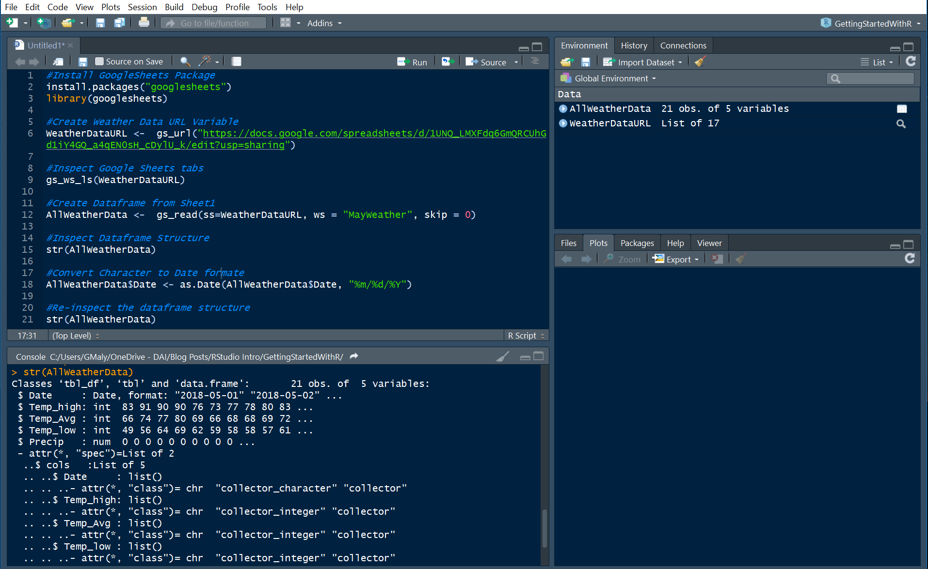
We can see that the date column is now in a date format, which will allow us to create our graph. Let’s move on!
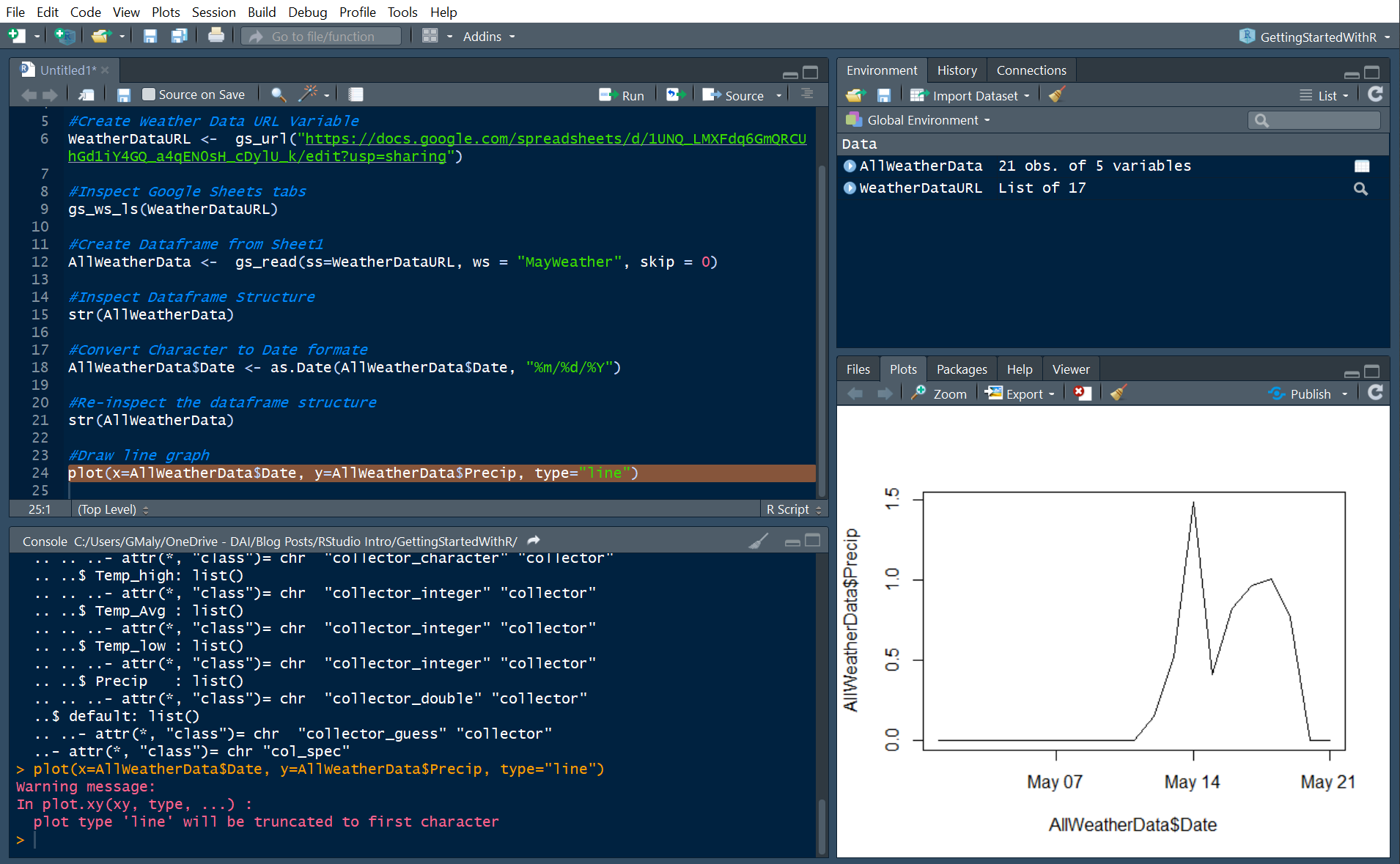
Step 6: Create Line Graph
We’re finally at the moment we’ve been waiting for. Let’s create a line graph using R’s core library graphics engine. R has many additional libraries for graphing, including the famous ggplot2, but for the sake of this exercise we’ll use the simplest option: the plot() function.
plot(x=AllWeatherData$Date, y=AllWeatherData$Precip, type=”line”)
In this function we told the computer to do three things: 1) plot date on the X axis, 2) plot the rainfall precipitation amount on the Y axis, and 3) draw the plot as a “line.”
Wrapping Up
And there you have it! You’ve created your first graph in R using data from Google Sheets, and seen just how much rain the Washington, D.C., area experienced over the past few weeks. Hopefully you learned a few things along the way. If you had any trouble installing RStudio, I’ve created an interactive R Console with all of the code pre-written, which can be accessed here.
Reflecting on this process, I’m reminded that most of the work that goes into data analysis is getting and cleaning data! We didn’t even get to the graph until the last step. For further analysis, we could, for example, compare this month to historical data. Can you now begin to think about how that might work using RStudio?
In my next post, we’ll explore this dataset further as we continue our journey into R and RStudio. Stay tuned!