5 Top Resources for Digital Access Data
Aug 20, 2018

The global community has recognized the importance of digital equality—affordable, universal internet access as one of the Sustainable Development Goals. When we are implementing digital programs, access and inclusion are key concerns: We don’t want to leave anyone behind.
The Principles for Digital Development, endorsed by a number of organizations (including DAI), aim to guide practitioners in applying digital technology to development in a way that is specific to the environment in which they are working. But how do we get the data to understand the ecosystem we will be working in?
Below are a few resources for data on digital access and inclusion, ranging from policy and regulation data, affordability stats, and gender-disaggregated data. The resources are from the past couple of years and while the digital world moves at lightening speed, these are still valuable sources of global information.
1. A4AI Affordability Report (2017)
The Alliance for Affordable Internet “Affordability Drivers Index” assesses the extent to which countries have implemented a number of factors that can lower the overall cost structure for broadband (i.e., affordability drivers). Countries are scored across two main policy groups—infrastructure and access—and ranked relatively to one another. The data has shown a correlation between this score and the price of a 1GB prepaid data plan.
The data goes back to 2014, which allows for handy comparison. You are also able to compare the 58 countries across communications infrastructure and access, and a number of subfactors. Under infrastructure, for instance, you can find out a country’s electrification rate, percentage of the population covered by the mobile cellular network, and the speed of broadband.
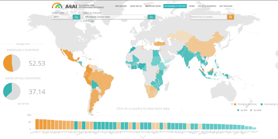
This is a great resource for overarching, high-level data on the connectivity ecosystem in which you are or will be working. It can provide an overview of how affordable the internet is in Nigeria, compared to other sub-Saharan African countries, or provide insight into how poor electrification rates in Malawi could be a factor in internet uptake. However, data is not aggregated by gender, rural vs. urban, or other factors and so cannot provide the detailed analysis needed to truly understand the ecosystem and design with the users in mind.
2. Economist Intelligence Unit (2018)
The Inclusive Internet Index uses quantitative indicators such as network coverage and pricing, and qualitative measures such as electronic inclusion policies and local content to assess a country’s performance. It ranks 86 countries on four criteria:
- Availability: quality and breadth of infrastructure required
- Affordability: cost of access relevant to income and levels of market competition
- Relevance: the existence of relevant local content
- Readiness: capacity to access the internet, including skills, cultural acceptance, and supporting policies
The index offers a lot more detail than the other resources—not just providing a ranking for each of the areas, but providing details of particular policies, broadband operators’ market share, and trust in online privacy, for instance. Importantly, under the “availability” criteria, the EIU has collected data on the gender gap in internet and mobile phone access for each of the 86 countries. The tool also allows you to select more than one country and brings the data side by side for comparison across all sub-areas—a really useful tool for regional analysis.
Updated in February, this is the most recent source of data and provides a solid basis for any desk research prior to digital development design. With the amount of detail here, you could spend hours (and many an hour I have spent) clicking through the four sections and numerous levels within.
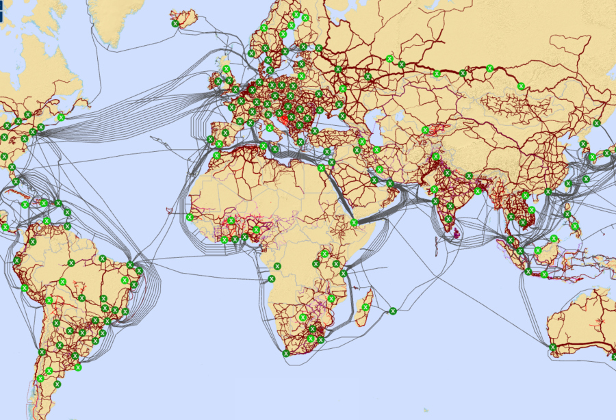
3. ITU Interactive Transmission Map (2018)
OK, so this is perhaps a bit of a weird one, but one I find interesting all the same. This map visualizes the internet connectivity of the world. Using existing public data and partnering with local and regional organizations, the United Nations’ ICT agency, International Telecommunication Union (ITU), has created a map of Submarine Cables, Internet Exchange Points, and World Transmission Links.
Yes, this doesn’t give us a picture of how connected people in a country really are, but it is handy for anyone working on higher level infrastructure or policy.
4. GSMA Mobile Economy
The Mobile Economy series provides insights into the state of the mobile industry worldwide. The data dashboard and accompanying report provides current data on mobile penetration and success of the market, as well as projections and major milestones to 2025.
The dashboard, split by region, allows you to see how many mobile subscribers there are in Europe; what percentage of people in Sub-Saharan Africa have 2G, 3G and 4G; and how much the mobile industry contributes to GDP. The Mobile Economy Report has some handy (downloadable) infographics outlining subscriber numbers, percentage of people that have smartphones, and penetration of “the G’s”.
Although most of the data is regional, some of the key data points are disaggregated by country, for instance, you can see unique mobile subscribers for the 10 largest countries in the world.
5. DAI Frontier Insights
The above resources outline how we can understand the ecosystem, but this country-level data can’t always help us to understand the users and their own personal context. This last point is a nod to doing your own research, working to understand the users, and designing the tools that work for them, with them.
We have featured various iterations of Frontier Insights on the blog, each bringing out an interesting insight into the lives of the people with whom we work. It has helped us understand how young people in Palestine tend to own two phones, young Malawians love to huddle together and chat with friends on WhatsApp, and a majority of people in Haiti don’t use mobile money due to a lack of trust mobile network operators.